Why Do So Many Brand Logos Look The Same?
Many years ago, I was asked to work on some logo designs for a would-be music artist. The start of these projects are always quite similar. I’m usually tasked with creating brand logos that epitomise ‘classic’ or ‘iconic’. The references will range from the Rolling Stones to Sub Pop. The discussions will be long and winding, as we try to disseminate the essence of the artist to a visual buzzword. Are they fun? Edgy? Romantic? Aggressive?
And thus it began. In the beginning the remit was wide and expansive, and I started in with a slew of graphic logos. Shapes, icons, and visual double entendres aplenty.
Fast-forward to many weeks later – maybe even months – and we finally arrived at an option which my client greeted with great abandon – the name of the artist in a black, sans-serif font, all caps.
Lo(go) and Behold
At the time I chalked it up to an unimaginative steer, but what was closer to the truth is the artist did not have enough of an identity, to warrant a graphic logo. The artist didn’t arrive fully-formed, and hadn’t yet dialled-in to any one style or ethos. The project was such that their musical direction could happily change at a moment’s notice to fit an opportunity. Therefore in such a case a logo (a graphic logo in the more traditional sense), is something of a risk.
For a budding enterprise a logo could alienate a potential audience, or confuse another. Maybe it’s not hip enough, or too hip and could date quickly. Or, it won’t be as cool as the other brand logos. Maybe everything will change. Or worse – stay the same.
Because a logo is a commitment. It represents the values of the body it stands before. By saying ‘this is who this person/business/organisation is’, it typifies and individualises. And if we’re not sure of who we are, the idea of committing to a symbol becomes a frightening prospect.
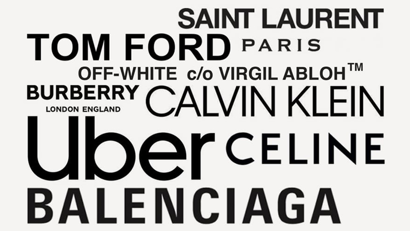
I’m reminded of this project of late, with the raft of brand logos (more so in fashion), abandoning their graphic flair in favour of stark, sans-serif word marks. To argue in favour of this however, does make sense. Often, design is a process of taking away and simplifying, rather than adding.
What’s in a Word Mark?
Word-mark logos are flexible and adaptable, and allow brands to be whatever they need to be. They’re content-orientated. They works in almost any context, against any backdrop or campaign image. They are a modern branding solution for a digital age. And as with my artist project, it allows the entire creative direction of the brand to change at a moment’s notice.
As identified by Thierry Brunfaut (Base Design), in a FastCompany article entitled ‘Why Do Google, Airbnb, And Pinterest All Have Such Similar Logos?’:
“People at the head of these powerful digital brands… know very well they are not defined by their logo anymore but by the product or service they provide.”
But on the flip side, there’s something about the trend that feels more like a cop-out. Unlike my artist project, many of these brands have history and even heritage. In abandoning their visual identity, they make a statement about individuality. The homogenisation of visual communication, could be considered a move away from imperfection. All of those little quirks and flaws of brands conceived in a simpler time, where logos were large and delicate, and didn’t have to account for smartphones and a 30 pixel max height.
It’s not always the case that technological progress means societal progress, and though the case for logo functionality in a digital age makes complete rational sense, I think we risk losing some of the romance that consumers bought into all those years ago. When everything looks the same, how can anything be distinct?
Content is King
I don’t believe every brand or artist needs a traditional, graphic logo. I actually often argue against this (ostensibly arguing myself out of a job). With start-ups and would-be superstars, I counsel content over everything. Make something of value first, then worry about buying costly branding. Many of the greatest musicians of the last couple of decades never had an official logo – or even a website (shout-out to ’00s Myspace).
But where it is appropriate, I think we can dig a little deeper in considering how brand logos evolve. We can find room for the quirky, the unique, the memorable. We can design brands that accommodate a raft of uses and platforms. And we can design graphics that embrace the digital age, rather than hide from it.
– Greg Bunbury