In Brand Design, When Is Simple Too Simple?
This month, two long-standing, iconic companies have rebranded with drastically simplified identities.
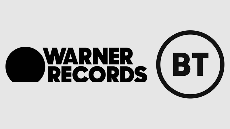
This week Warner Bros. Records (now shortened to Warner Records) debuted a new Pentagram-designed mark, replacing the classic Warner Bros shield with a slightly cropped circle.

Warner Records described the design as “artful simplicity and impactful typography that are ideally suited to the digital world”. The public response has ranged from largely negative to decidedly visceral.
And earlier this month, the telecoms giant that is BT (formerly British Communications), also launched new branding to much discussion and even greater derision.
Where previous iterations of their identity over the decades had embraced colour and symbolism (often encapsulating logo trends of the day), such flourishes have been jettisoned in favour of two stark letters in a circle.
According to reports, BT CEO Philip Jansen has confirmed that the company-wide rebrand will be implemented this summer.
These moves follow a trend of simplified identities across several industries, some of which I discussed in this blog last year.
Both the new Warner Records and the BT identities have been met with an overwhelmingly underwhelmed response. This response is largely directed towards the primary logo designs themselves.
But is the mostly negative response deserved? Is this a case of brand design being lazy and uninspired, or an example of a new approach to branding?

Context Is Everything
First, we need to consider what branding in 2019 is. Today’s leading brands are contextual. Their value is in their product. And the product is the marketing.
The job of branding for thousands of years, has been distinction. This is shown in Stone Age-era painting, that indicate early man may have marked cattle with symbols applied in paint and tar.
Fast forward to the 1800’s, the rise of mass production, and shipment of trade goods. Producers begin burning their brand-marks into crates to distinguish themselves from the competition.
All the way to the glory days of the 1950s, where consumer packaged goods companies like Procter and Gamble practically pioneer the discipline of branding as we know it.
But I’d argue the kind of distinction necessitated by commerce of old, with several brands sat next to each other on a shelf, each vying for your attention, is a remnant of the past.
Today, we interface with brands in all sorts of ways, but rarely on face value.
We compare prices online, read Tweets, click on reviews, check scores, like photos, and rate responses.
Considering all the ways we connect with brands, their logos are a minuscule consideration. What’s more important than the brand design, is the brand identity.
A brand’s identity results from a consistent story, and an understanding of what matters – today.
Simple Is As Simple Does
I simply cannot say this enough – a logo is not a brand. And like it or loathe it, both Warner and BTs new logo, are just parts of a branding system.
Take the marks at face-value, and of course they look fairly basic. In the case of BT It’s two sans-serif letters in a circle. For Warners it’s a filled circle. Anyone could do that.
Except it isn’t, and they can’t.
Judging a brand design by the logo (in its most basic form), is like judging a concert by the photo on the front of the programme.
Now, this isn’t the case for every single brand that’s opted for a mono word mark in the last 12 months, but in the case of these two examples, the logo lives in a wider system.
And when we consider this – the wider context – things begin to make sense. We start to see the visual identity in the context of the strategic objective. Suddenly it takes shape.
There’s a reason creative pitches will often feature pages of brand applications. That’s because good design doesn’t exist in a vacuum. It’s bigger than the logo.

As reported by Marketing Week a BT spokesperson stated the motive behind the new branding, was largely due to the switch from an offline to an online communications landscape.
When so many companies are fast-evolving into digital platforms, with several levels of offering, products and experiences, the prospect of static branding becomes a redundant one.
The ability to manage, scale and adapt branding to a multitudinous media landscape becomes vital.
Moving Up
Let’s also consider the touchpoints for the truly modern brand. Historically, consumers would primarily engage with branding and design through print.
This might have been direct mail, print ads, physical signage or merchandise. All these elements have a commonality – they’re static.
But the primary touchpoint for the modern brand is digital. It’s YouTube, Instagram, video games, apps, DOOH, AR & VR. And digital is dynamic.
So brand design doesn’t need to be restricted to the printed page. And with this, the function of brand design changes.
Logos can move and morph. They can reveal content or direct our gaze. They can exist in a 3D world. In short – they can also be dynamic.
On paper, the Warner Records logo looks pretty basic. But in a digital world, it’s simplicity becomes engaging.
Don’t Play To The Crowd
So graphic designers will sneer and jeer, and the general public will initially balk at such dramatic changes in familiar brands.
But many designers are execution-focused. Their job is concerned primarily with aesthetic outcomes. They’re technicians.
But businesses that matter are less concerned with execution, and more focused on strategy.
There’s less value in execution, that’s why it can be found cheap. Anyone with a computer can make a shape and call it a logo.
But not anyone can shape and build a brand that will last a hundred years.
Strategy wins elections. Strategy wins wars.
So if Warner Records and BT are able to weather the storm of public opinion in the short-term, one day we might look back at these bold rebrands with admiration.
Of course there is the possibility of a GAP-like backtrack, after they attempted a rebrand to a scathing response.
But as long as the strategy behind the rebrands remain solid, as long as there is truth in the ‘why‘, this could be the dawning of a new era in brand design and visual communication.
Simply put, it’s probably going to be better.
– Greg Bunbury