A new strategy and brand for this interactive company.
Quintessence are a UK-based interactive technology provider, specialising in the creation of digital, interactive experiences for leading brands and businesses. Their mission is to innovate how people work, with tools that transform office, retail, residential and event spaces. Perfect for a socially distanced world.
After 10 years as a market leader in this space, and with a growing suite of products and services, Quintessence needed a full brand overhaul.
The objectives were to update their old branding, consolidate their various offerings, deliver a raft of new sales materials, and present a cutting-edge identity to attract high-profile customers.
The challenge:
To simplify a complex solution making it easy to understand for current & potential partners.
Services:
Brand strategy
Positioning
Copywriting
Brand identity
Logo design
Marketing materials
Web design
The old brand:

Examples of Quintessence’s old branding & comms
The rebrand: a touch of strategic thinking.
We started the process with a live whiteboard strategy session with the client. The purpose of the session was to guide the client into the branding process, while learning all about Quintessence. This session enabled us to experience the Quintessence story and understand their aspirations, as well as the specific needs of their key target customers and audience.

Pages from the Quintessence whiteboard strategy session
Connecting the dots: brand positioning.
Pulling together our marketplace research, along with learnings from the whiteboard session, we begin to distill these observations into insights and business objectives. Creating a foundation on which to build an effective brand strategy and positioning.
We profiled Quintessence’s current and target customers, identifying their needs and how best to speak to them (tone of voice).
Our research indicated that Quintessence’s competitors in the interactive technology space focused on the ‘what’ and ‘how’ in delivering solutions. This created a space for Quintessence to differentiate, by placing more focus on the ‘why’.
Based on our analysis, the brand voice of Quintessence needed to be both Innovative and Supportive. The brand identity should feel Premium and Confident.
From this data we crafted positioning, a mission statement, key messaging, brand pillars and marketing funnels.
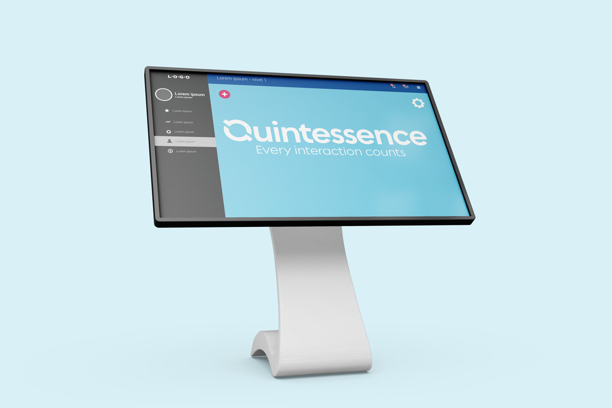
We also created what would be the Quintessence tagline: Every interaction counts.

Pages from the Quintessence strategy & positioning document


Quintessence positioning docs
The tagline: 'Every interaction counts'.
Our new tagline connects what Quintessence does (interactive experiences), to how Quintessence works (interacting with customer collaboration and support), and to why organisations should use Quintessence (customer engagement and interaction).
Feeling blue: mood board & colour research.
Following the strategy and positioning exercise, we began to translate our insights into a visual style. This was established with a round of mood boards, to establish colour and aesthetic for the identity phase of the project.

Mood boards

New Quintessence colour palette
Q&A: identity & logo design.
Simple, clean, modern, confident and distinct. The logo clearly positions Quintessence as a technology company, but with a strong emotional drive for both interactive experiences, and impeccable customer relations.
The circular Q device subtly conjures themes of touch technology, connected spaces, and ongoing support. The device also serves as an icon, making the logo versatile and responsive across mediums.
The typography is contemporary, ownable and premium, showing Quintessence as a strong, trustworthy brand – a market leader – engendering trust and confidence for its customers.
Quintessence primary logo lockups

Quintessence branding extensions
The launch: making a powerful first impression.
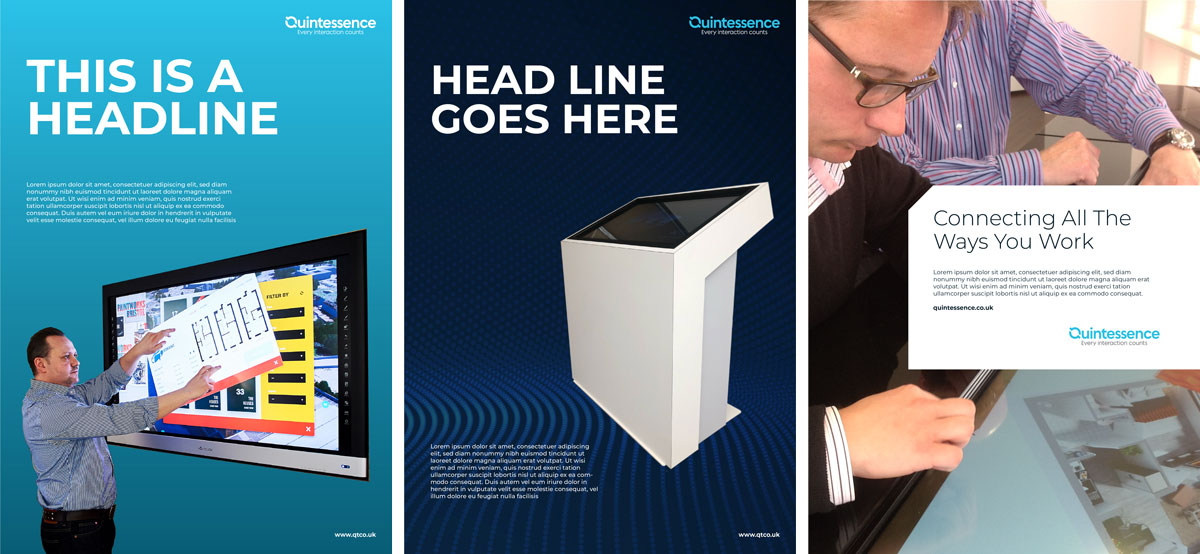
Once we had established the new brand identity, we began the roll-out over key communications. This initially comprised a raft of sales brochures.
We designed the Quintessence Grid – a system to create pages within the Quintessence brand style. It ensures that all communications are consistent and robust. The grid offers flexibility and clarity, and can be adapted to a range of purposes.
With the Grid as a starting point, we designed distinctive looks for the sales brochures and case studies. Working with the client, we then crafted the copy and structure of each document.


The Quintessence page grid

Quintessence main brochure cover and inner pages

Quintessence brochures by sector

Quintessence case studies
Transforming the website.
Our next task was to apply the brand principles of interaction and transformation to the Quintessence website.
We designed a new online destination to enhance our customers digital experience, reorganising information and content into a user-friendly structure.
We prepared wireframes, graphics, icons and crafted web copy, all of which was built and implemented by the in-house Quintessence team.

