'A Thing of Beauty' - a campaign for London
The City of London Corporation delivers programmes of activity to engage, educate and inspire. To raise awareness of the City as a cultural and heritage destination, while incorporating its progressive stance on diversity, the environment and sustainability.
However, the previous programme, Fantastic Feats, reported low participation from communities and people of colour.
This year, the Corporation needed an identity and campaign that speaks to inclusion, environmentalism and collective action, through the lens of celebrated poet John Keats for this year’s campaign, A Thing of Beauty.
“Endymion” is a poem by Keats first published in 1818. The poem begins with the line “A thing of beauty is a joy for ever”.
The challenge:
To design a cohesive identity for A Thing of Beauty, to be used across multiple events, websites and marketing materials. The identity and campaign should embody and align with inclusivity, diversity, sustainability, the arts, and environmentalism.
The work should help drive up social engagement, participation and attendance from communities and people of colour. Also contributing to attracting talent and tourists to the Square Mile.
Services:
Brand identity
Campaign design
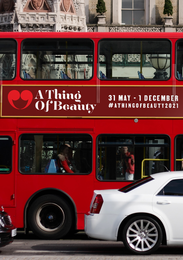
Campaign extensions

The spirit of revolution through Keats' words.
Although the popular image of John Keats is that of a romantic draped in solitude, in actuality his was a period of friendship and collaboration. He was a champion of the arts, and to the endurance of creative endeavour.
Born to a time of revolution and upheaval, he remains an optimist in the face of melancholy. His immortality assured in a reunion with nature.
The following identity and campaign concept for A Thing of Beauty seeks to align the values expressed in Keats’ prose, to the issues of today’s world. Diversity, sustainability, culture, collaboration.
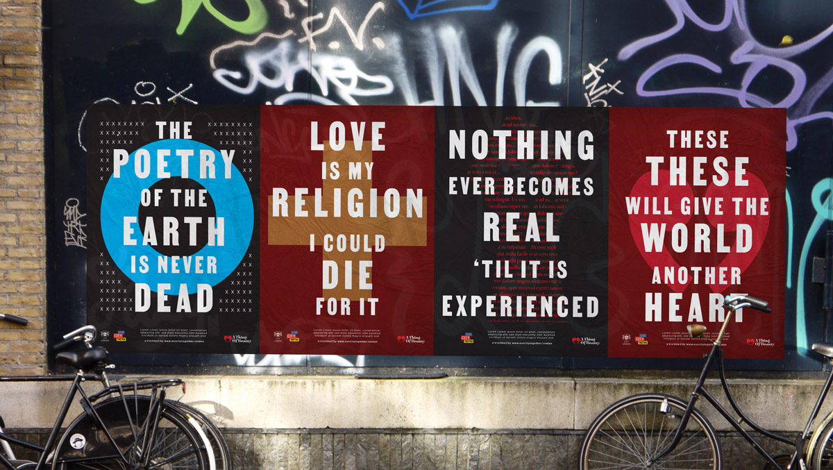
To make his words relevant to our time, and the diverse populations of today’s London. I represent the beauty in his work, through the words themselves, in the most efficient and direct manner possible. His writing in stark, and modern type, framed by graphic treatments of typography. Old becomes new again.
Inspired by civil-rights era posters, and social justice campaigns, the spirit of empathy, love and connection lives on in the words themselves. Enduring beauty for times of uncertainty and change.
Mood boards & image research.

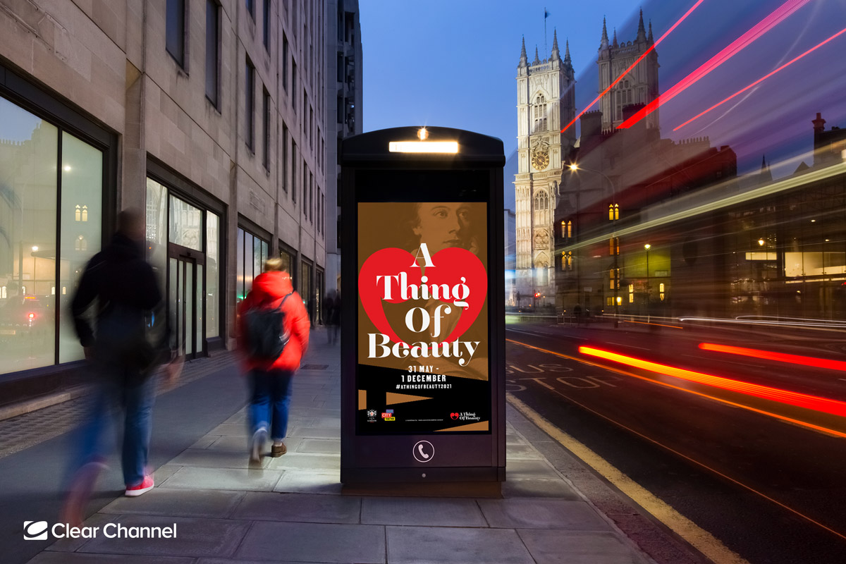
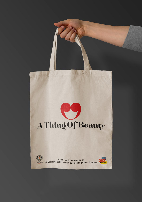
The brand identity.
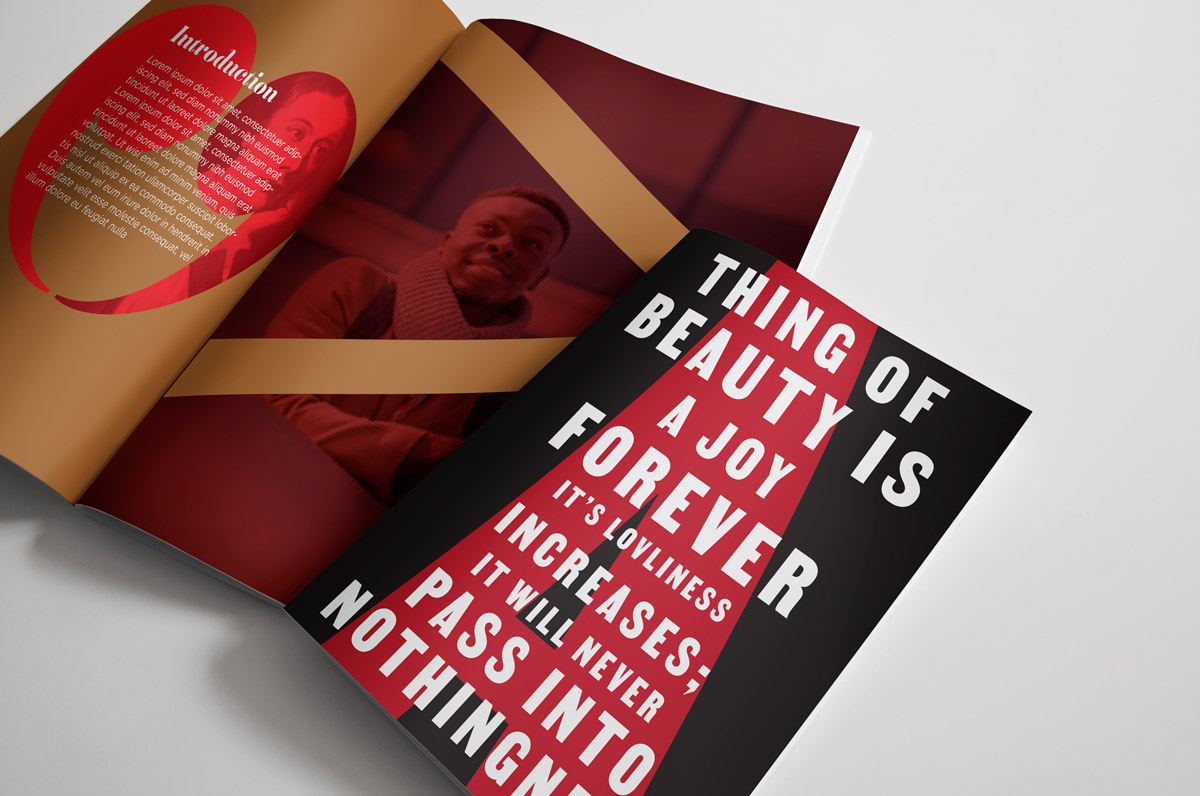
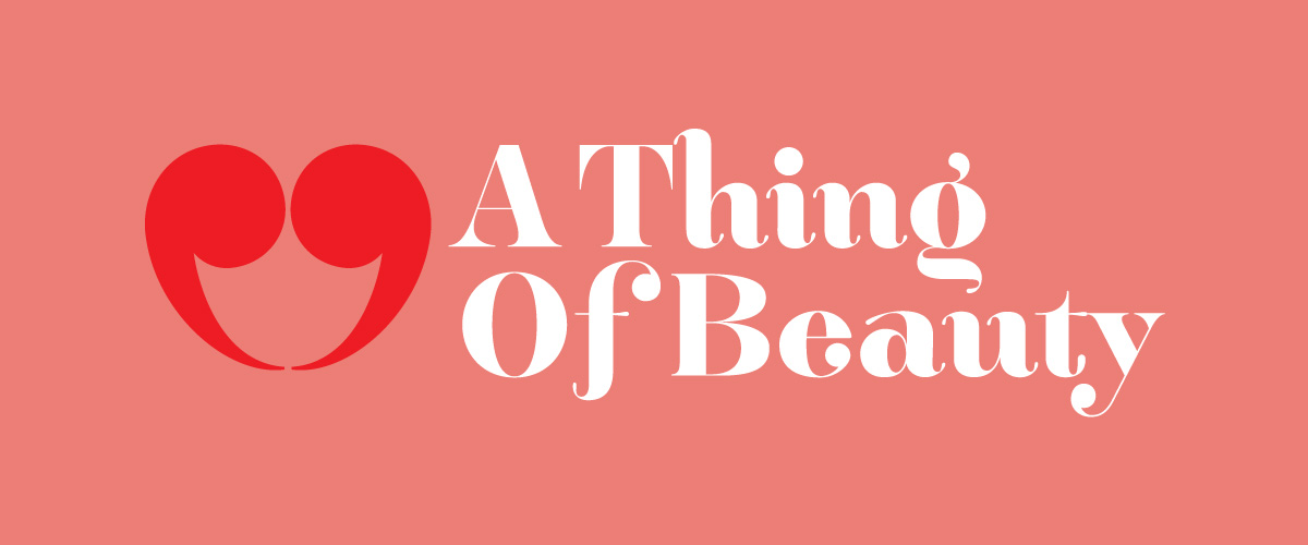
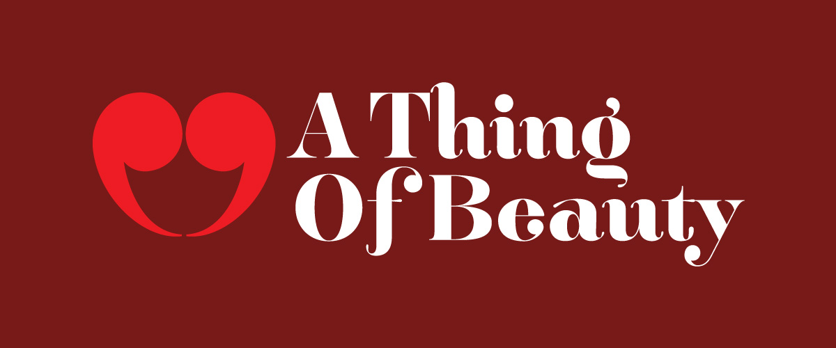
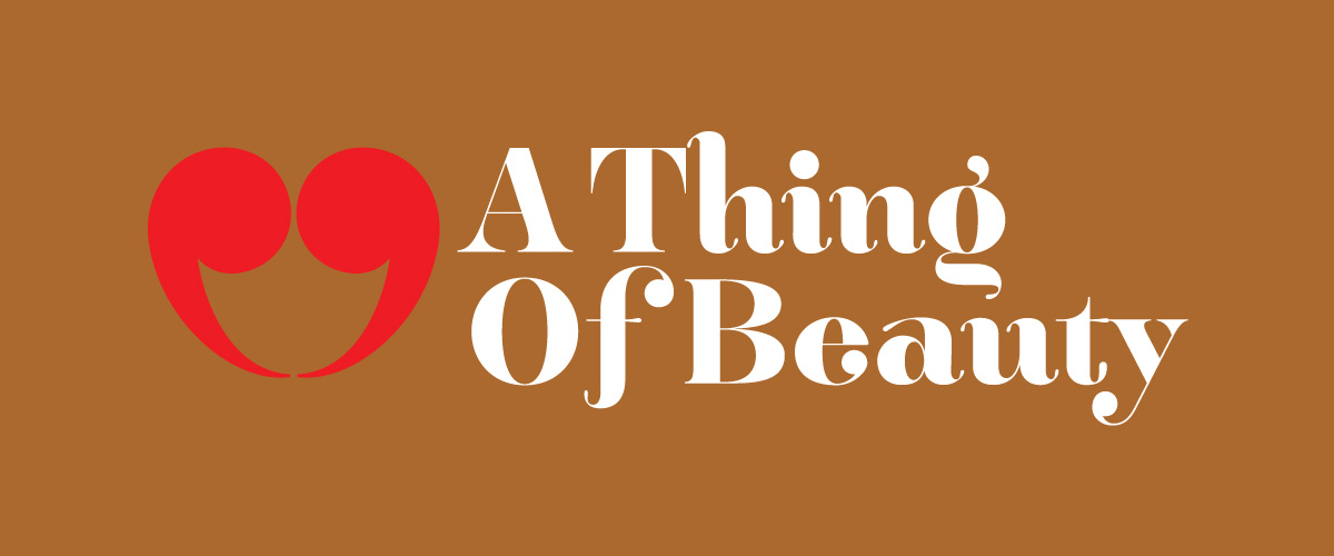
Centred around the prose of Keats, a typographic speech mark is transformed into a heart. Cursive typography creates a contrast against the stark typography of the wider campaign. The identity is framed against a romantic colour palette that calls to mind regality and passion.

The campaign.
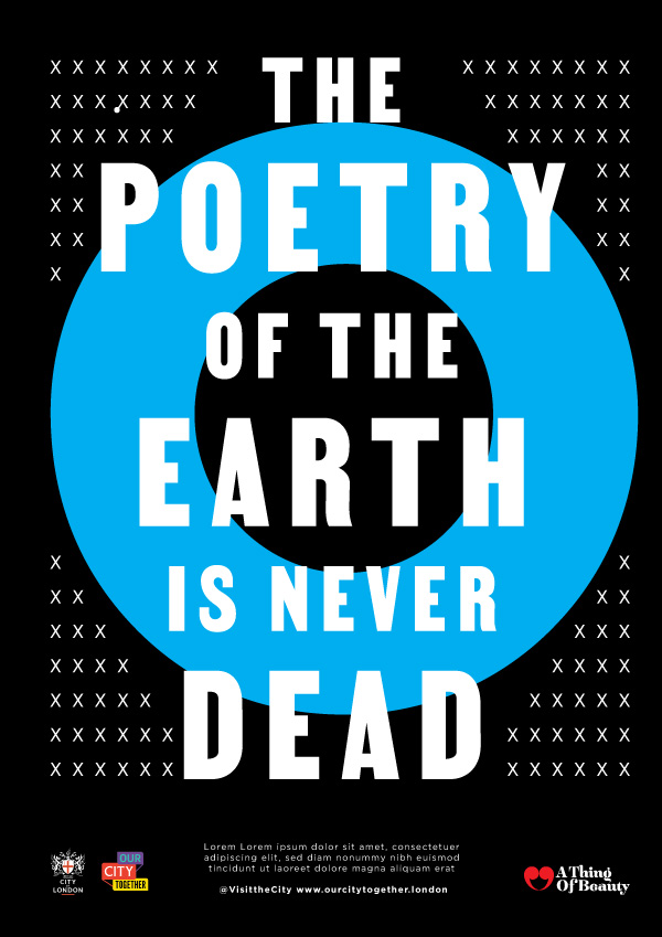
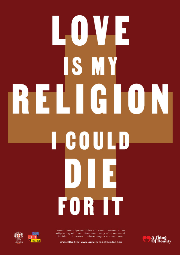
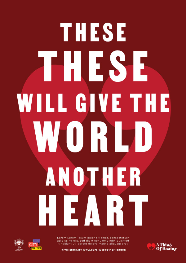
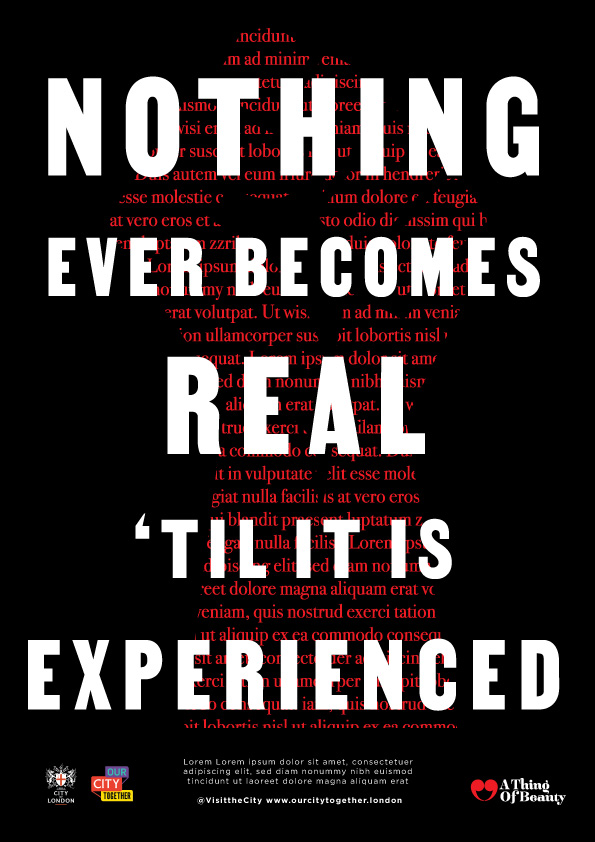
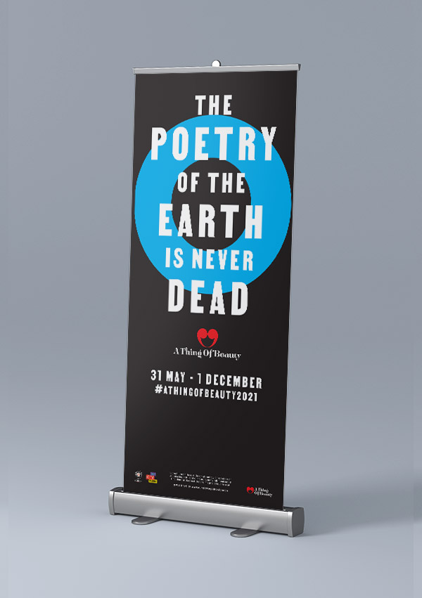
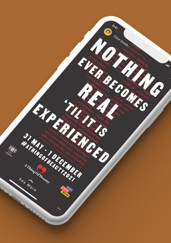
Taking selected works of Keats’, quotes are typographically presented in a way to create resonance with today’s societal issues. The posters are created entirely from typographic elements, reinforcing the focus on the words themselves.
Shapes and letters are dynamically juxtaposed, giving the designs a printed, letterpress feel.
Thematically, the executions are framed around the environment, sustainability and social justice. The powerful typography draws a line from the past to our present, and an aspirational future.