A pitch-perfect logo for a NY music company.
Boss Sounds is a music management and marketing/PR company, based in New York. Their clients include major record labels, entertainment brands and heritage artists. I was commissioned to design their new logo.
Objectives:
Create a new logo & brand identity for Boss Sounds.
Results:
Brand to Mouth created a unique and on-brief identity, well-received internally and throughout the target audience.
Services:
Branding
Logo Design
Sound vision.
The brief was to create a logo that was visually synonymous with music, completely ownable, premium, and responsive.
I began the project with a client strategy session. I workshopped what their overall business goals were in having a new logo, and the values it needed to embody.
The client referenced iconic music logos such as Blue Note Records. I set out to create something equally as recognisable, but more contemporary.
The new logo needed to sit alongside partner and client marks, and feel as though it deserved to be there – a new player in the music business.
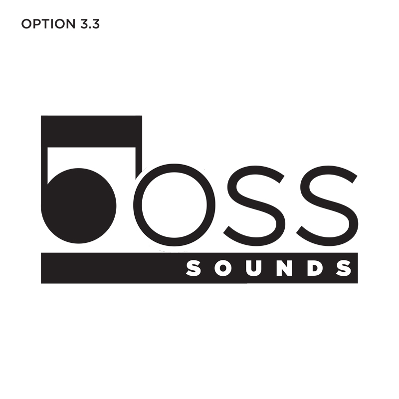
From this, I developed several initial concepts:
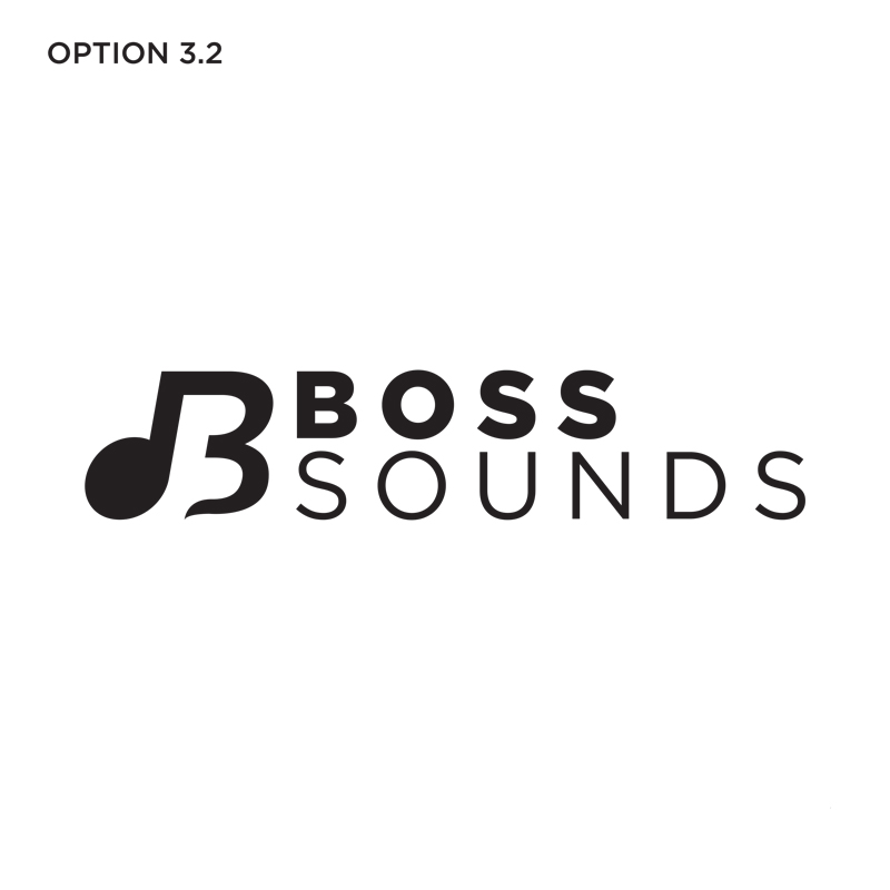
Hitting the right notes.
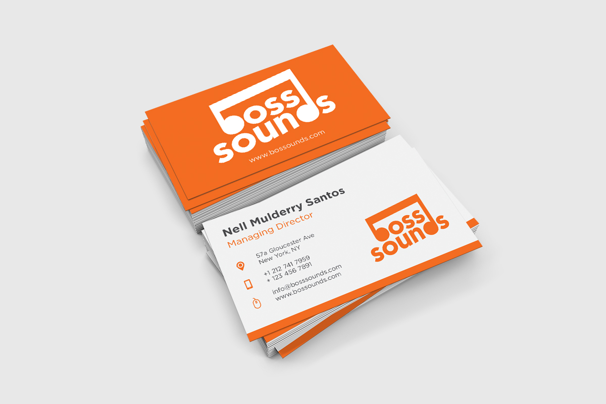
The client shortlisted the option with the ‘b’ and ‘d’ joined as a quaver. This idea was then refined using a heavier typeface and stronger lines. The slanted orientation created upward energy. Lowercase type works as a visual device for the quaver, and softens the mark keeping the brand accessible.
I developed a colour palette of logo colour-ways, with orange as the primary version.
The final Boss Sounds logo is clear, simple, and impactful. It needed to be dominant enough to create gravitas, but still preserve legibility for tablet and mobile devices.
Getting ahead.
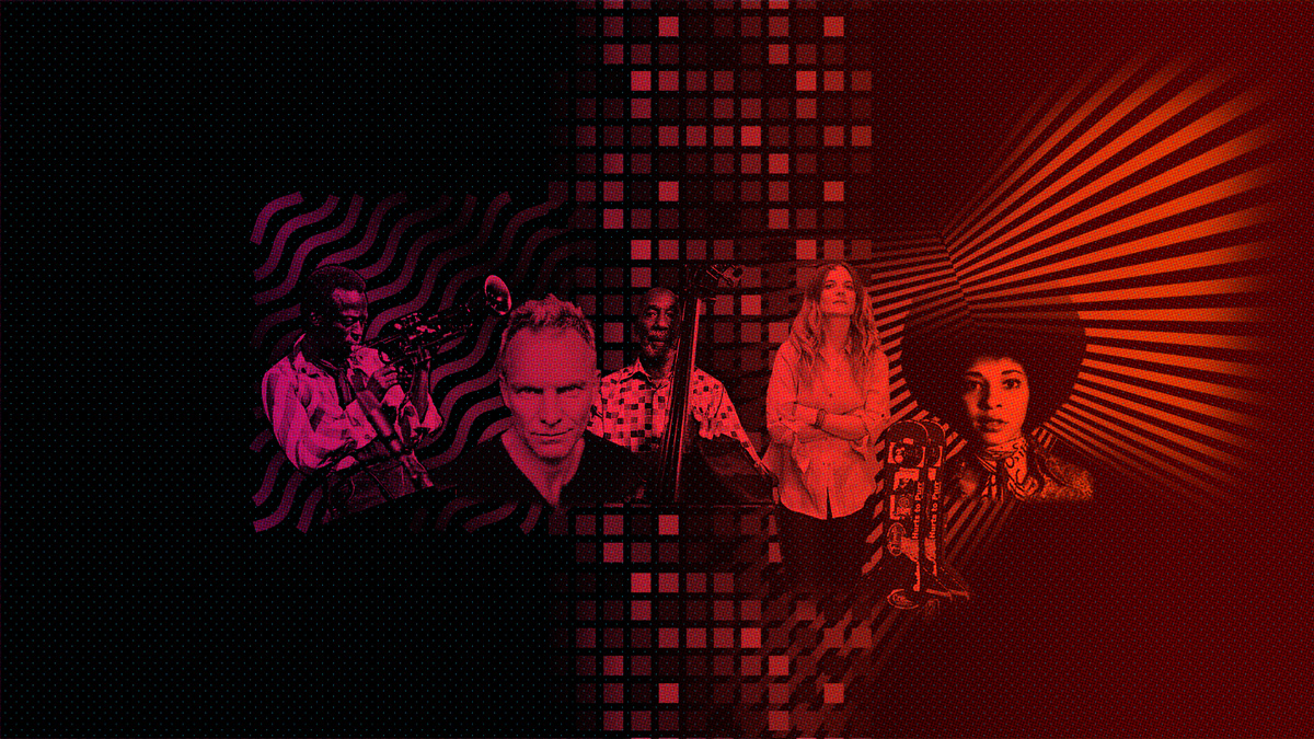
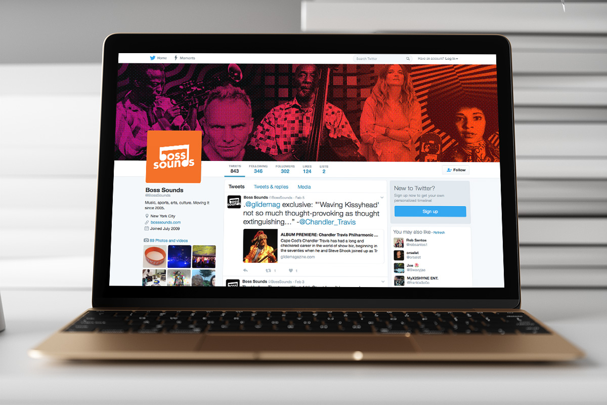
Once completed, the client asked me to create a series of collage-style images for the Boss Sounds website, and social media accounts. The images were to feature artists represented by the agency.
The brief for this stage called for engaging, exciting header images that would reflect the musicality and energy of the brand, and the artists they worked with.
I incorporated patterns into the images to create a visual story around the Boss Sounds brand. The shapes that make up the patterns, are motifs inspired by the artists. Waves reflect the fluid, improvisational qualities of jazz, while cubes and lines represent structure and composition.