A clean new look for this music brand.
Bleach Productions are a music and audio production company. Based in North London, they’ve been successfully supplying bespoke and library music since 1996. With much expansion in their catalogue and increased client engagement, I was asked to develop a new logo design and identity for the business.
Objectives:
Create a new brand logo & identity for the business.
Results:
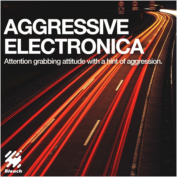
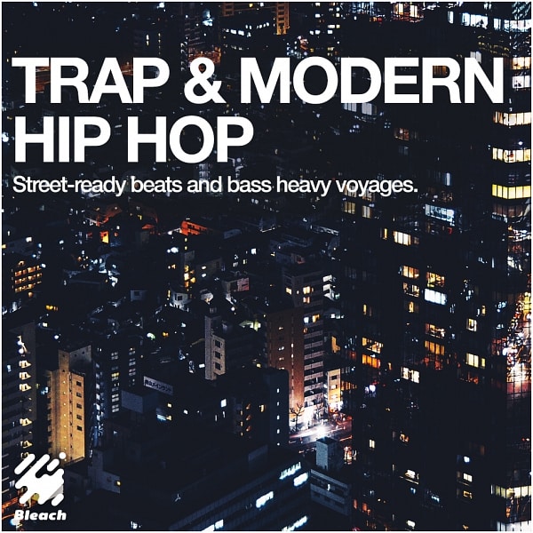
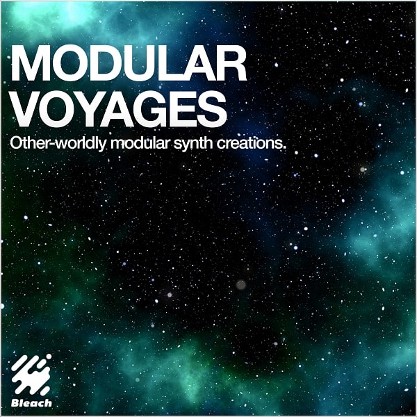
I created a strategic, and unique logo identity for Bleach. It correctly positioned the business, enabling them to release a new, extensive range of packaged library music.
Services:
Branding
Logo Design
Moving the needle.
The brief for the logo was “a contemporary/modern logo that also captures the essence of classical record labels”.
The mark had to be black & white, and needed to feature geometric or spatial interest (shapes or abstract patterns).
The client supplied references of existing logos they liked, made up of music brands from the 70s to 90s. Examples included iconic marks such as the Warner Music logo, Decca, Columbia, Elektra, Atlantic and Warp.
The first wave of options drew on these references, while trying to find an ownable concept for the logo. This ranged from visualising the word ‘bleach’, or linking the mark to sound or music in some way.
Cleaning up.
These designs established an aesthetic approach for the final brand logo. From here, I explored shapes resembling liquid in a state of transformation.
The abstract shape that evolved from that process, functions as an icon and a graphic device. I sourced a dynamic yet unique typeface, that best fit the tone of the brand, and brought in a retro feel to the logo.
I delivered the final Bleach Productions logo in 3 lockup iterations, each covering a wide range of applications across print and digital.