Designing a world-class brand identity.
Continental Drifts Music have been programming festival stages for over 15 years, at some of the UK’s largest music festivals. Their project, Global Local aims to showcase the best musical talent in the country.
Global Local provides performance opportunities to emerging artists from a wide range of cultures and communities, for festivals, community events and club nights.
Bunbury Communication Design were invite to submit a tender, creating a new brand identity for Global Local.
Objectives:
- To create a holistic identity for the Global Local brand.
- Create a style and brand experience across the new identity.
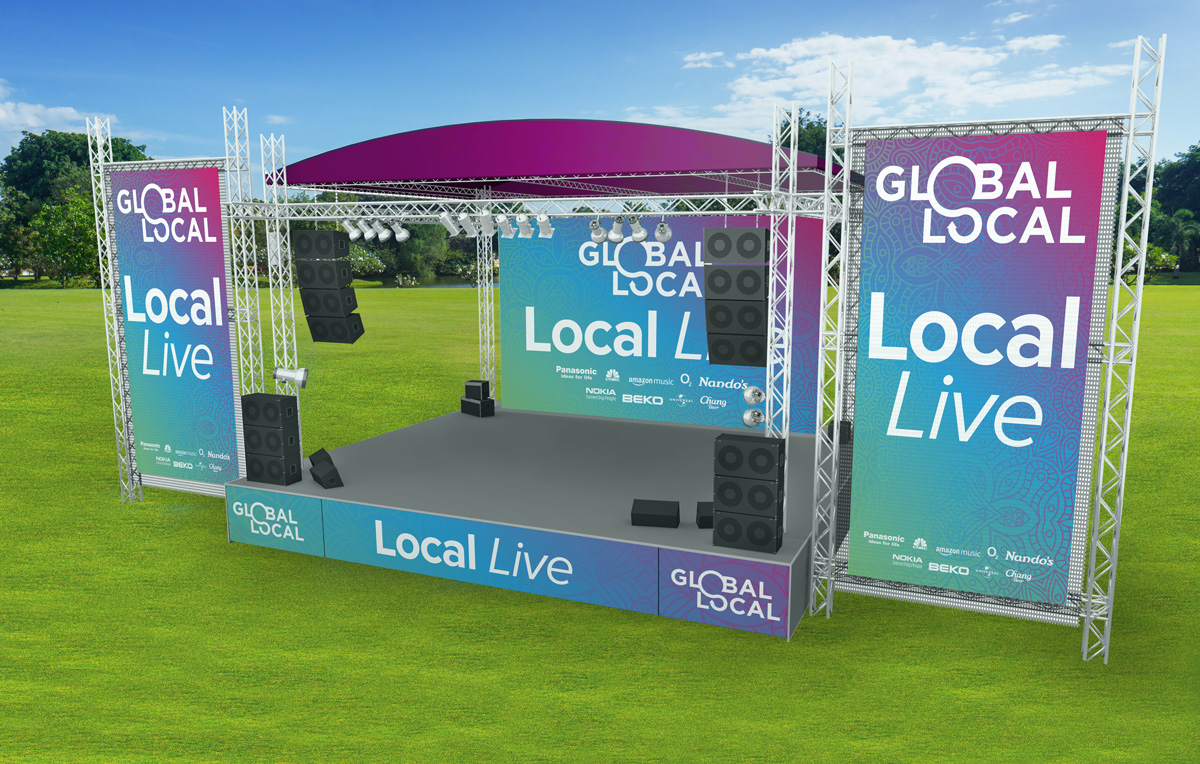
- Demonstrate the scope and potential of the new identity across mediums.
Results:
Bunbury Co created a unique and on-brief design, and a brand identity system.
Services:
Branding
Logo Design
Good value.
I began the project by brainstorming with the client. I identified their overall business goals, and the core values the new mark needed to represent.
Based on the brief and my analysis, the essence of the new mark for Global Local can be explored through 5 key brand values.
These values are a key part in establishing a brand identity. They provide a foundation on which a true, cohesive visual language can be built. They are extended beyond the mark, through art direction, messaging, copy, and tone-of-voice.
Brand values are invaluable both internally and externally. They create a comprehensive, consistent and robust brand identity. One which fosters trust, presence and confidence.
Global
Dynamic
Responsive
Versatile
Confident
Inclusive
Vibrant
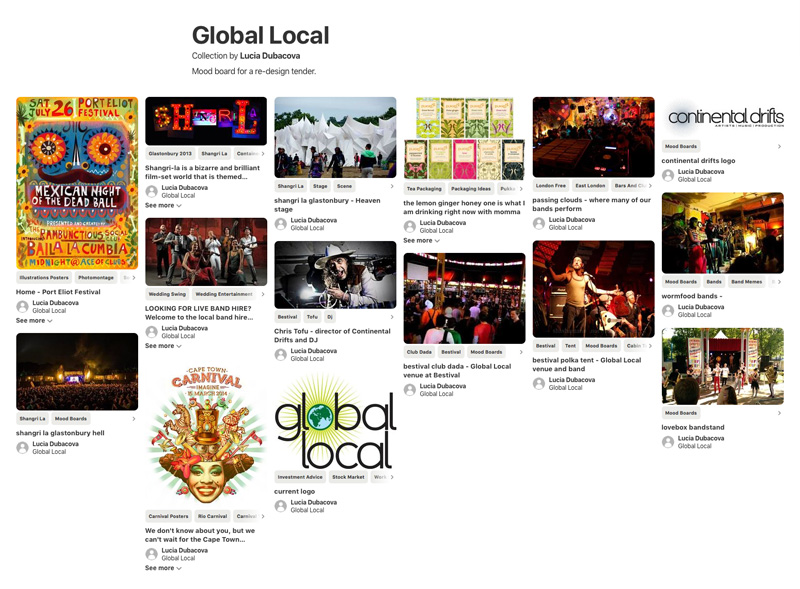
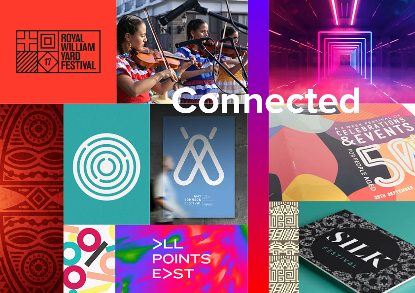
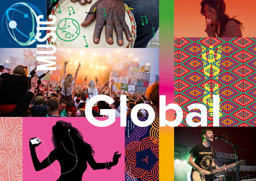
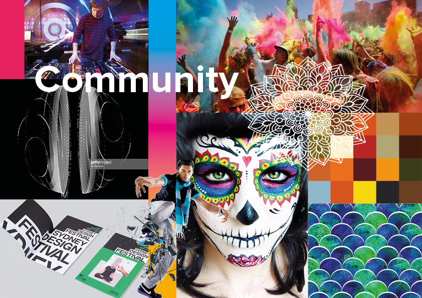
Style council.
To follow, I developed stylescapes to establish a visual style moving forward. This would provide a start point for crafting the logo, and building an identity around the Global Local ethos.
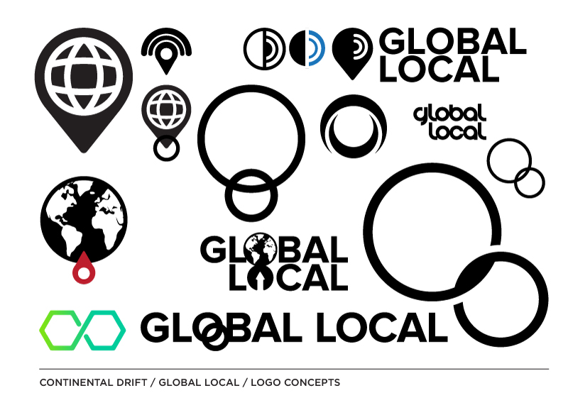
Local hero.
To ensure a versatile, strong and confident identity, the logo had to work as a mark and a device, anchoring the brand. It needed to be clean, unfussy and timeless, and sit alongside leading brands in this sector.
My design is inspired by connecting the global with the local. This is represented by the connecting spheres of the letter ‘o’s. This concept reinforces ideas of community, togetherness, and collaboration.
Globe trotters.
In building assets for the wider brand identity, I needed a concept to bring the energy of Global Local to life.
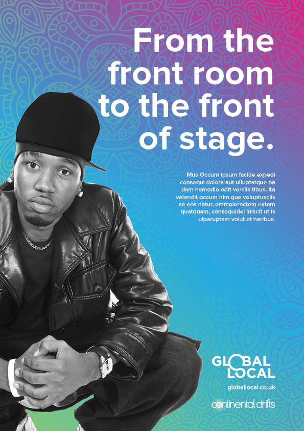
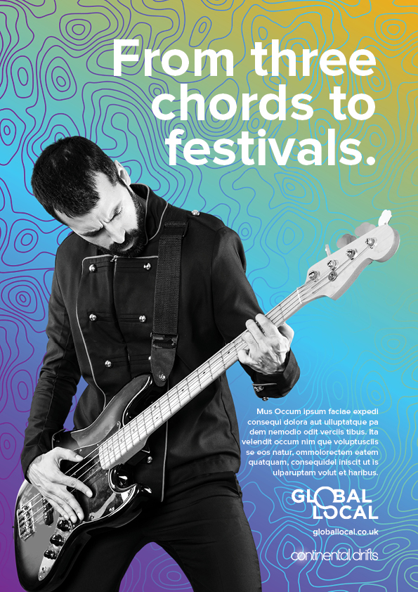
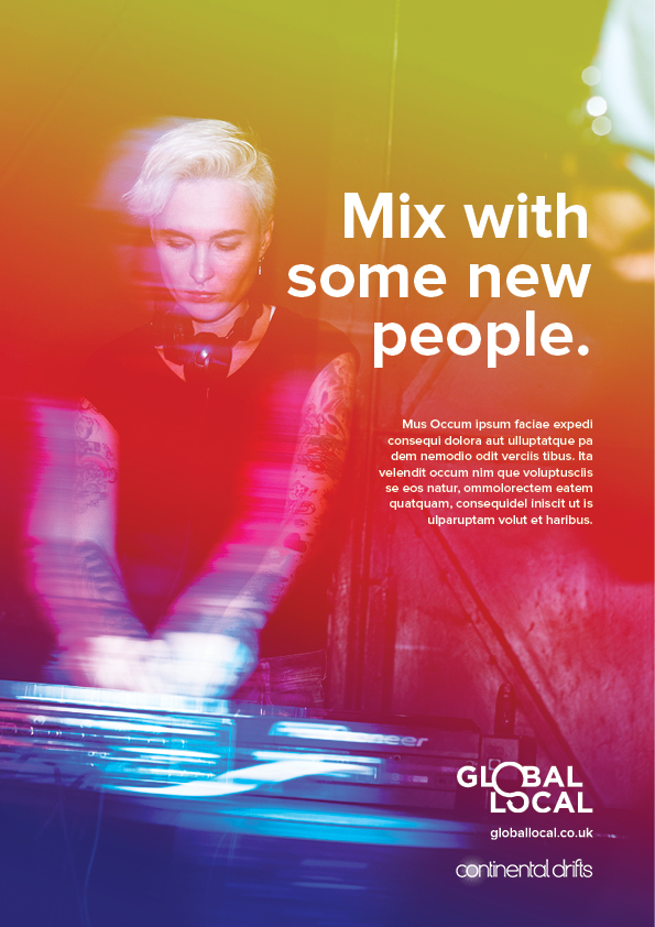
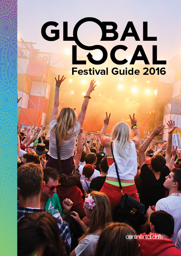
The brand-led imagery needed to be bold, dynamic, colourful, energetic, inclusive and globally-minded.
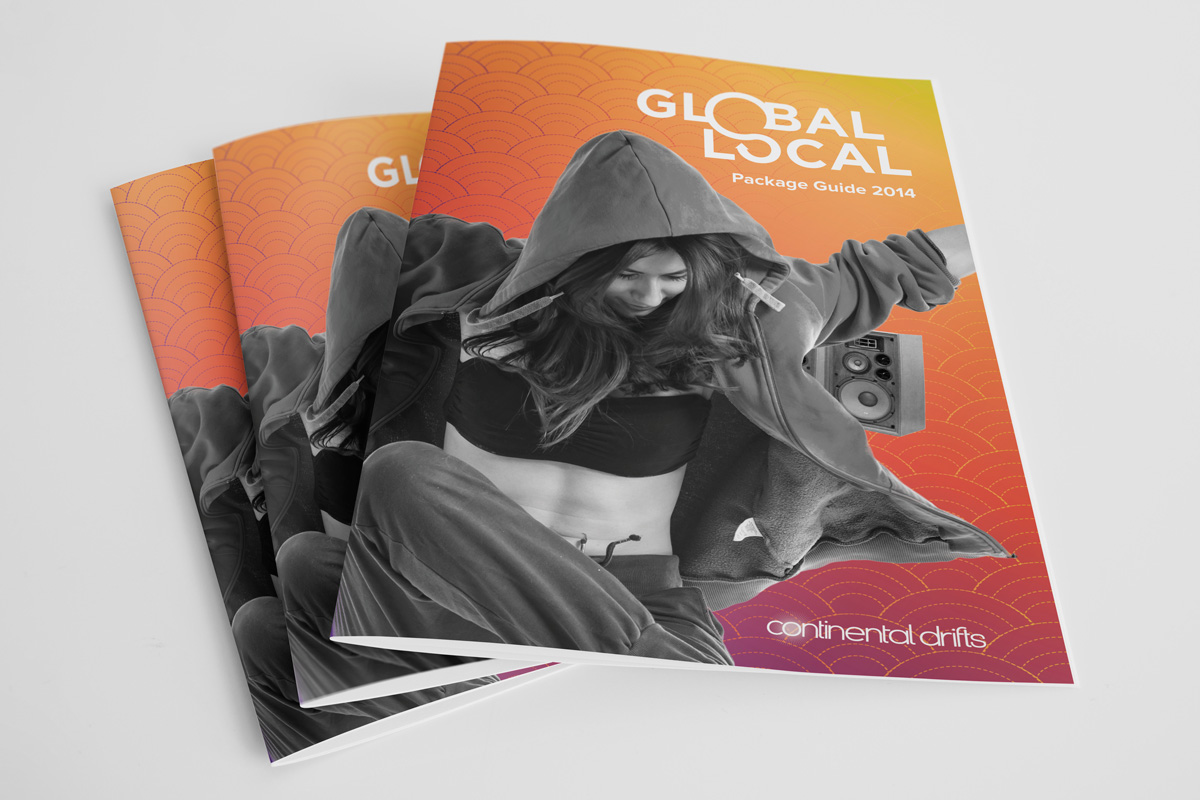
I created a series of backgrounds utilising ethnically-inspired patterns, against vibrant colour gradients. The backgrounds are both global and contemporary, and bring a dynamic element to the brand.
This bold use of colour brings energy to the visuals. Combined with dynamic photography, the concept is adaptable throughout a range of applications.
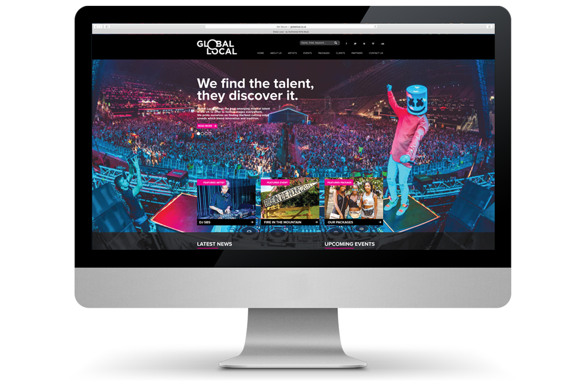
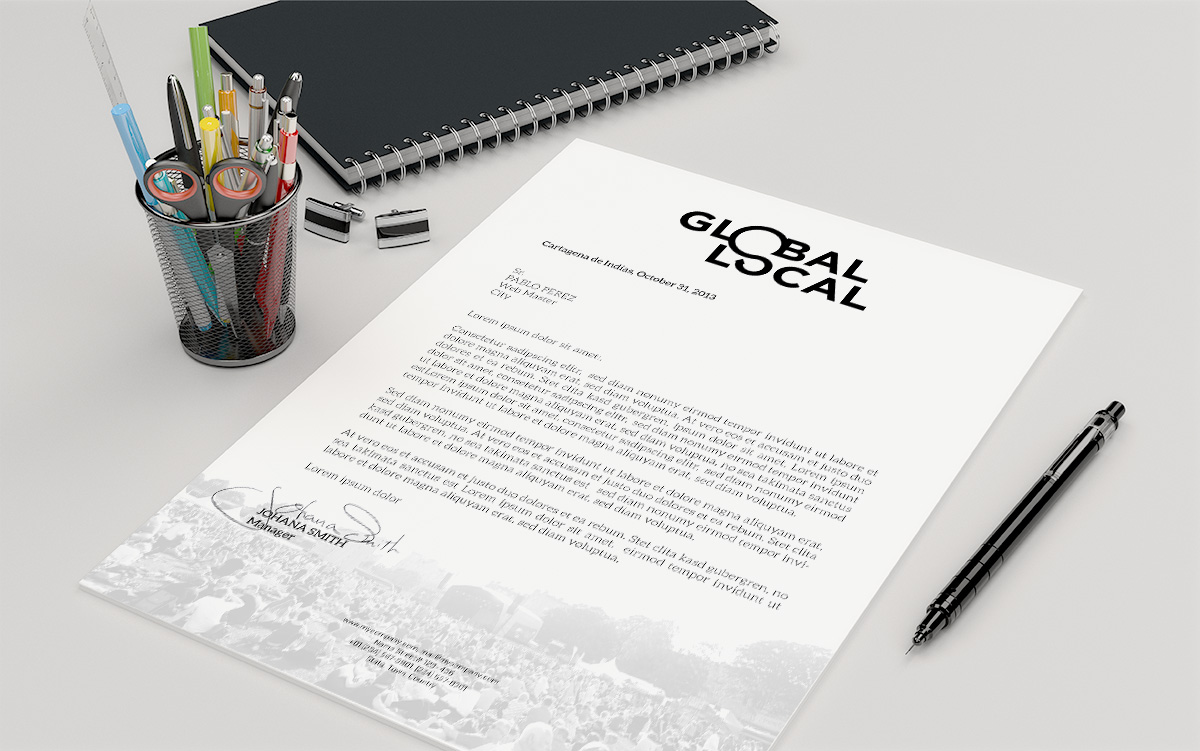
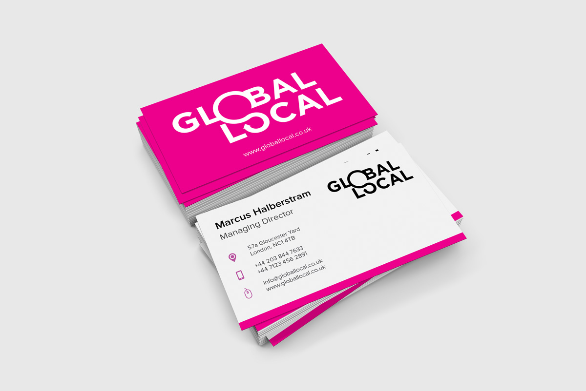
From brand environments to web, and brochures and press advertising, the identity retains consistency and cohesion.