Branding and Exhibition Design from South to North.
Letters from the Global South is a free travelling exhibition and workshop on climate change for community groups, schools and faith organisations in the UK, highlighting the impact that the climate-nature crisis is having around the world. The project is a collaborative effort between Muslims Declare and Zero Hour.
I was retained by Zero Hour to design branding for the project, supporting materials, and an exhibition stand for travelling workshops.
In creating this exhibition, Muslims Declare/Zero Hour are collaborating with activists in different parts of the world, therefore the branding and exhibition materials needed to appeal to a diverse ethnic demographic and appeal to Muslim communities in particular.
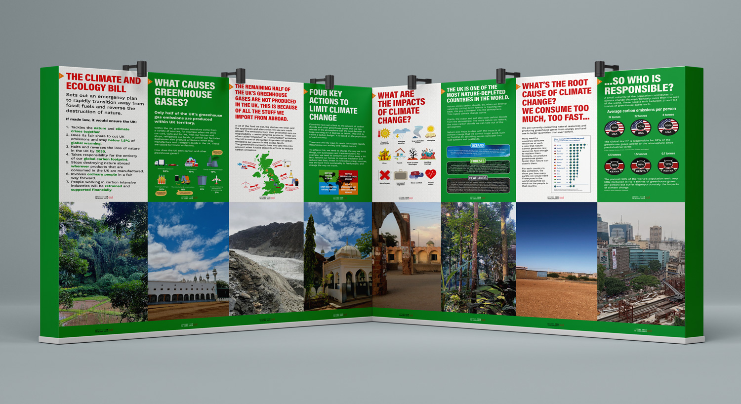
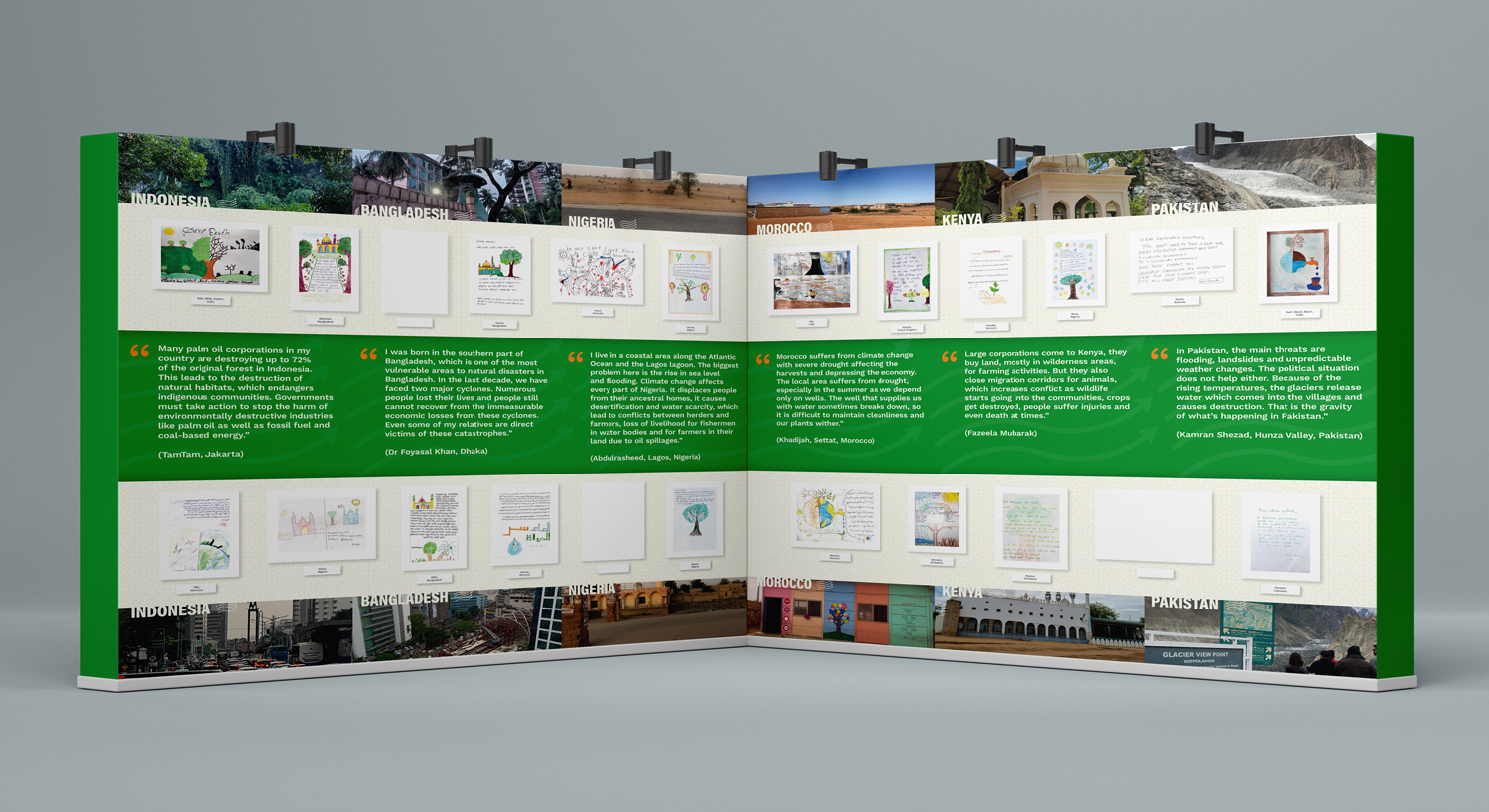
The aim of the exhibition display was to present key concepts of the Climate and Ecology Bill, inviting attendees to write letters to MPs in support of the Bill. The exhibition will tour a network of mosques and other community spaces in the UK.
Services:
Consultancy
Logo design
Brand identity
Exhibition design

The Logo & Identity.
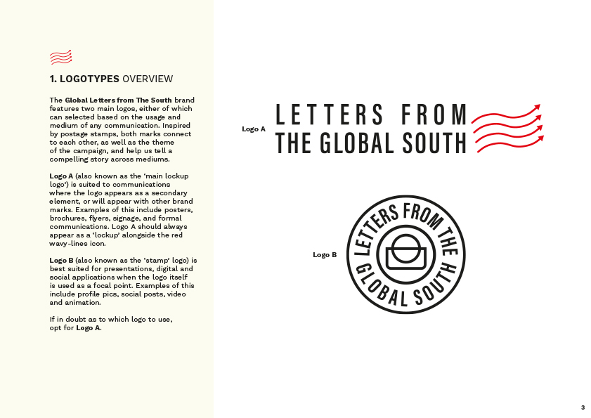
Letters from the Global South main logo by Greg Bunbury
Letters from the Global South alt logo by Greg Bunbury
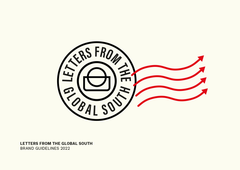
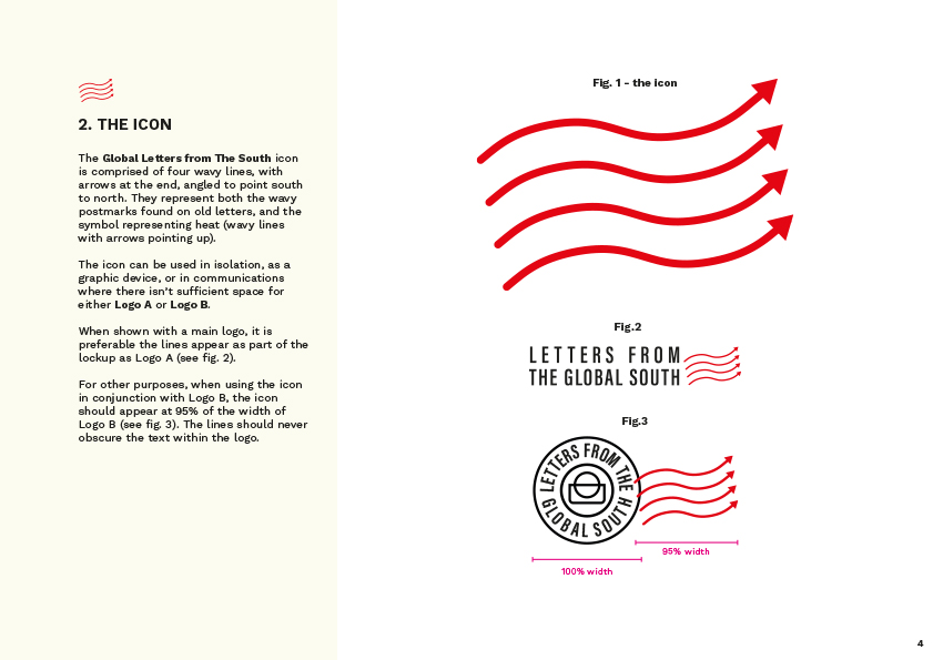
Letters from the Global South icon
After a round of consultancy on the exhibition name, the client settled on ‘Letters from the Global South’.
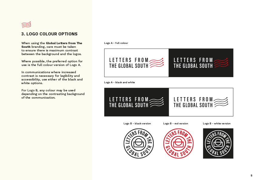
The logo we created for the project is inspired by stamps and postage marks. The logo is conceptualised as both a circular icon and a rectangular landscape version.
The logo concept was based on the wavy postmarks often found on letters, which have been adapted with arrows to resemble heat-flow lines. This way they suggest both the act of letter writing and rising temperatures of the climate-nature crisis. This visual concept also doubles as the brand icon.
The circular version of the logo is centred by an icon of a globe intersecting an envelope. This provides both versatility and adaptability for a wide range of mediums, uses and formats.
The logo is contemporary, clean and premium. It avoids many of the tropes associated with Muslim culture and overwhelmingly tested positively with younger audiences – a key consideration in the campaign planning.
From here, we developed brand guidelines for subsequent applications to establish a cohesive visual identity and style.
Brand Guidelines.
Exhibition Display.
For the exhibition element, we advised on suitable display solutions and approaches. Then using content supplied by the client, we designed a series of display stands that would travel with the exhibition. These stands would display the letters themselves as a gallery, as well as urgent information about the climate-nature crisis, the Climate and Ecology Bill, and how communities can take action in response.
Our remit was to create a visual format that was clear, engaging, accessible, and legible for a diverse audience across demographics and ethnographics.
Letters from the Global South exhibition display stands
Visit the Letters from the Global South website here.