Cutting-Edge Design for a Theatre Classic.
The Lyric Theatre, also known as the Lyric Hammersmith, is a theatre on Lyric Square, in Hammersmith, London. Billed as the civic and creative heart of West London, the organisation believes that everyone deserves to experience the life changing impact of theatre.
In support of a new production of Patrick Marber’s Olivier Award-winning play and hit film, Closer, I was asked to design a new poster for the show, and materials for the wider campaign.
Services:
Creative direction
Graphic design
Artwork & production

25 Years of Love and Lust.
Closer was first performed at the Royal National Theatre in London on 22 May 1997; since then the play has been produced in more than a hundred cities in over thirty different languages around the world. In 2004, Marber adapted the play for a film of the same title.
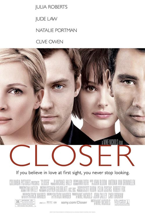
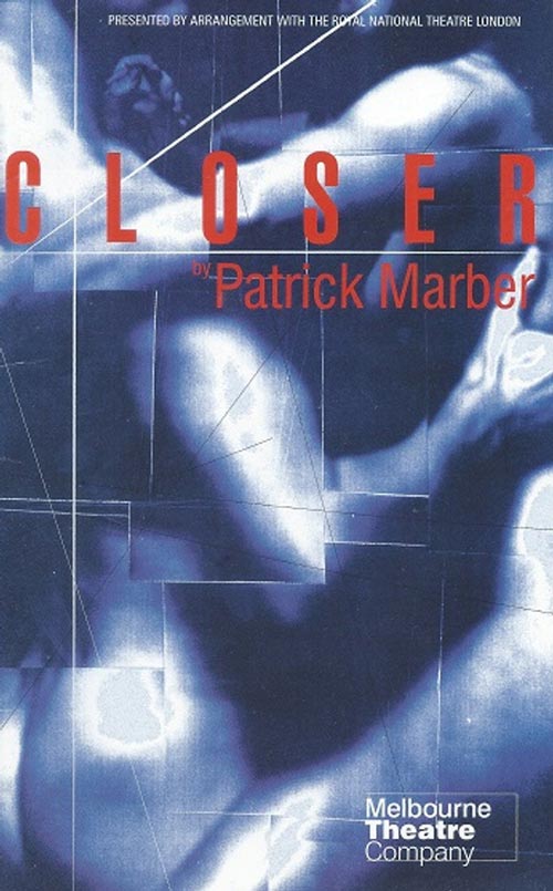
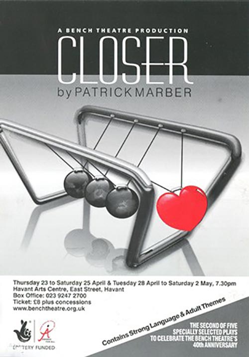
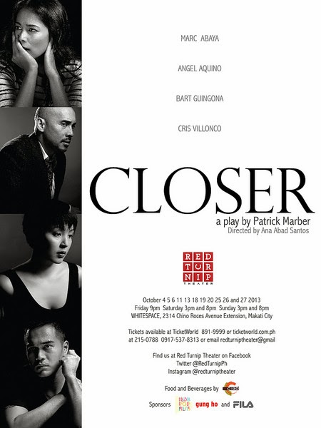
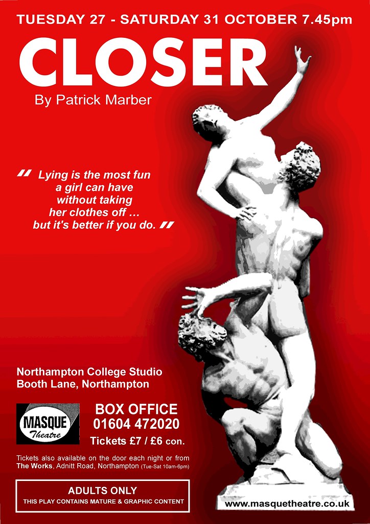
There have been a multitude of poster designs for Closer over the years. The challenge for this brief was to create something unique, that held some synergy from previous (and perhaps more visible) iterations of the production – such as the film.
Therefore the theatre poster needed to speak to fans of the play, and a new generation about to discover it.
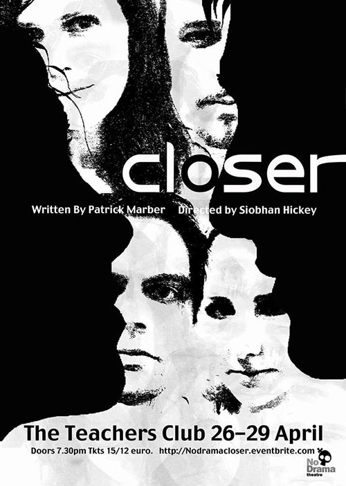
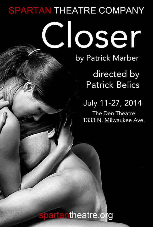
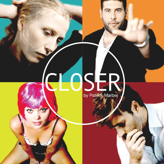
Old Hollywood to Modern London.
I sought to answer the question of how we make this version of the poster simple, fresh and contemporary, while speaking to the iconic film poster.
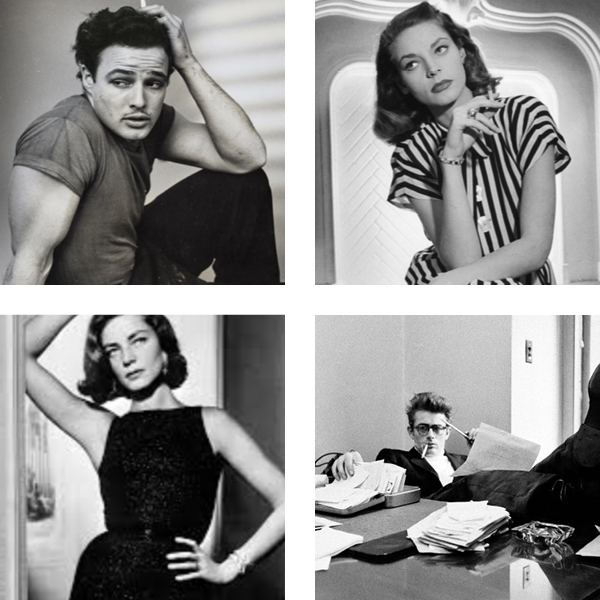
To kick-off the design process, the Lyric team and director Clare Lizzimore supplied me with a raft of visual references. In particular were these portraits of Hollywood icons from the 1950s.
The references were to “inspire … and create a sense of Hollywood glamour and iconography … to capture something that is truly beautiful and iconic …” My aim was to create artwork that elevated the play above typical theatre poster design.
Ideas that Made the Cut.
I wanted to create an aesthetic that helped tell the story of Closer. The play was described as “examining physical intimacy, proximity and our emotional language.” So I set out to design something that represented the inherent tension within the story. Fragmented connections and messy separations – broken, chaotic and dynamic. But also intimate and vulnerable.
This was visualised by this idea of ‘sliced’ images. I recall once seeing someone cut filmstrip, and this concept felt fitting in telling this story, since photography is such a catalyst in the early section of the play.
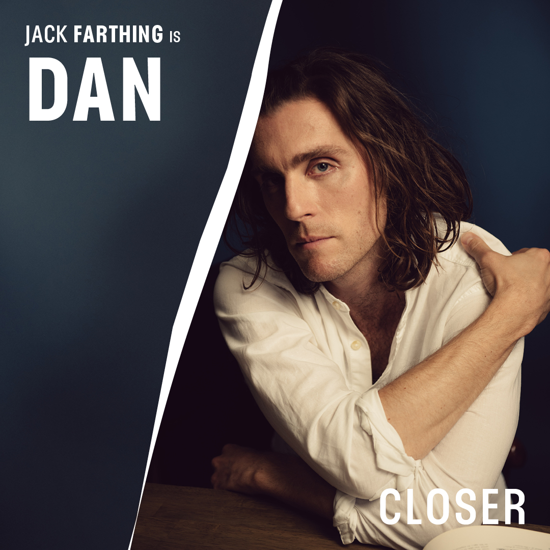
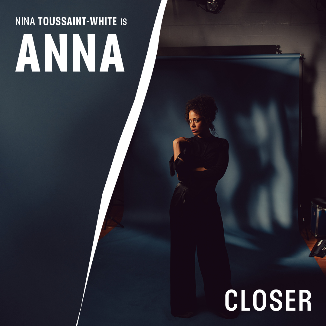
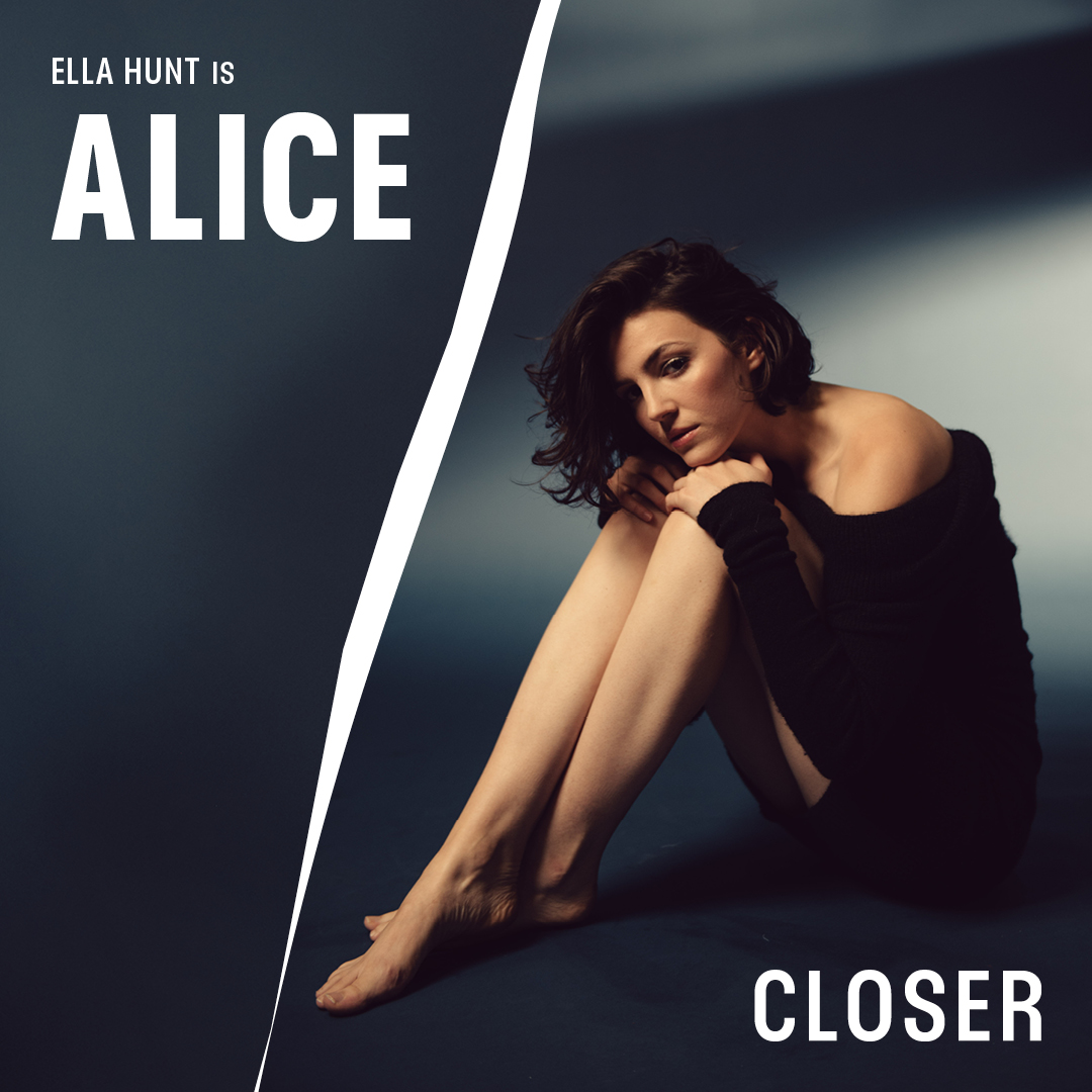
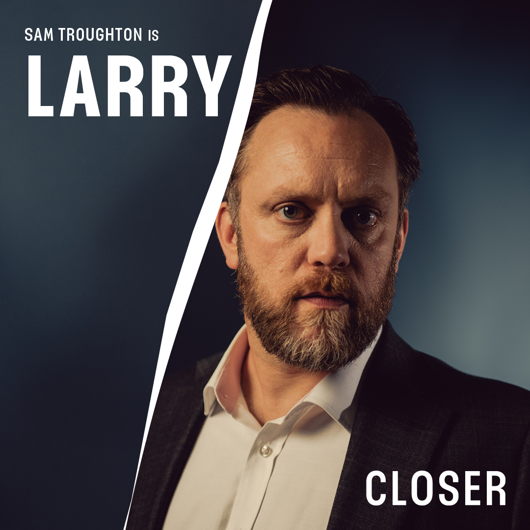
Following these initial concepts (with placeholder images), the client commissioned photographer Jennifer McCord to shoot portraits of the actors for the final poster.
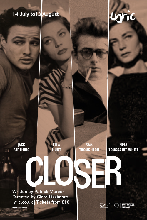
Initial poster mockup for Closer, by Greg Bunbury
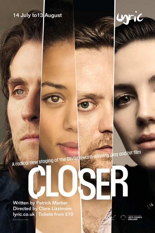
Initial poster mockup for Closer, by Greg Bunbury
A Slice of Design.
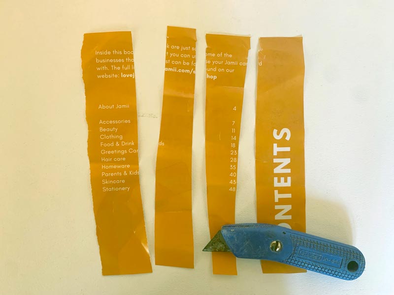
While the actors were being photographed, I felt that the ‘slices’ in my initial layouts, were perhaps too clean and artificial. They didn’t encapsulate the energy and passion I wanted to convey. They needed a sense of unpredictability and disruption to them, so I decided to create the splits by hand.
Using a box-cutter knife and scrap paper, I created several sliced strips. When I felt happy with the overall shape, I scanned the slices and created containers for what would be the each individual actor on the page.
Final Cut.
With the fantastic new photography in place, I finalised the key artwork for Closer. The title is now clean, impactful and legible. The typography sits in synergy with the ‘house’ style of the Lyric, but the treatment feels unique in its own right.
The ‘sliced’ splits feel more natural and crafted. They bring an increased sense of drama to the proceedings, while enhancing the framing of various elements, but they do not compromise clarity.
As a piece of theatre poster design, it meets and excels the brief. It feels classic-yet-modern, iconic, sensual, dramatic and aspirational.
From here, I extended the artwork to a wider campaign of promotion for the play.
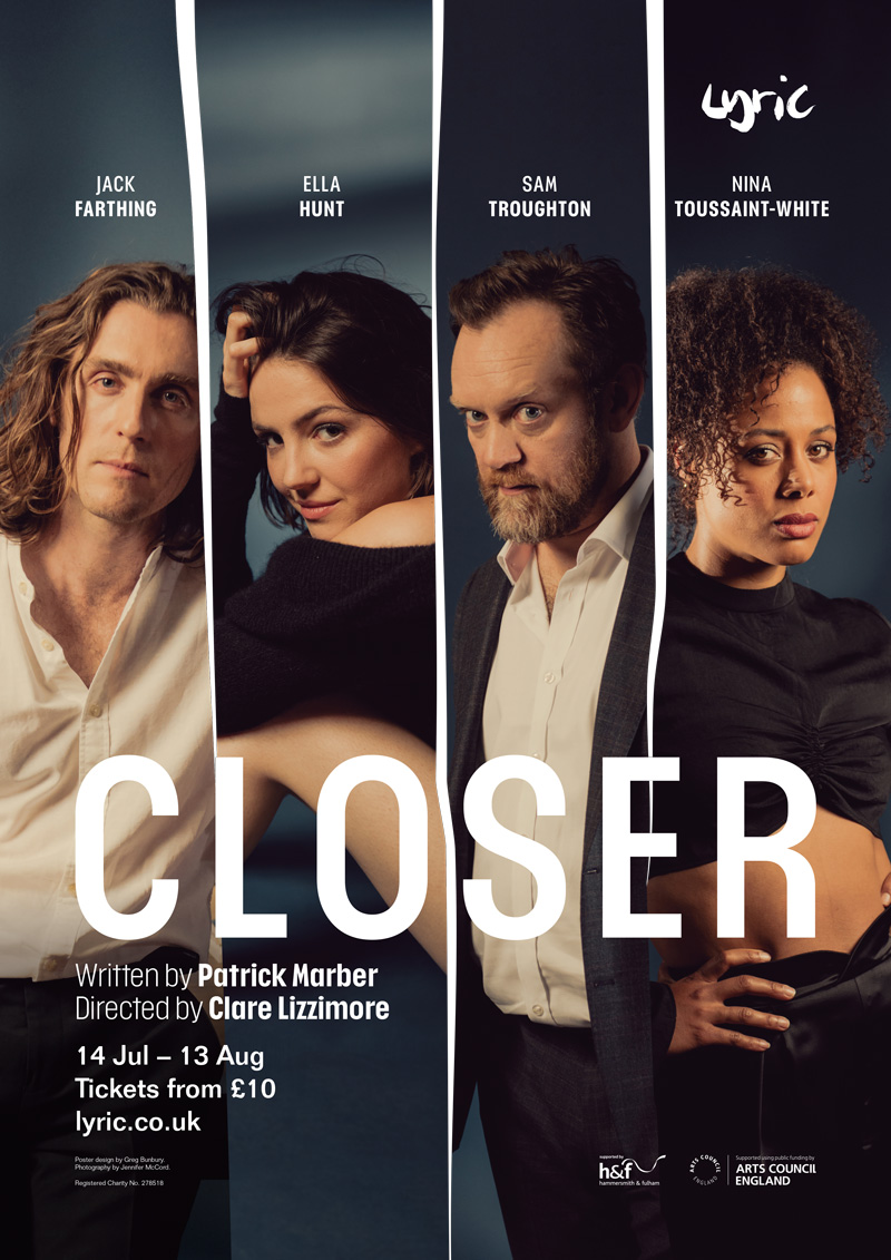
Closer key art/theatre poster. Design by Greg Bunbury.
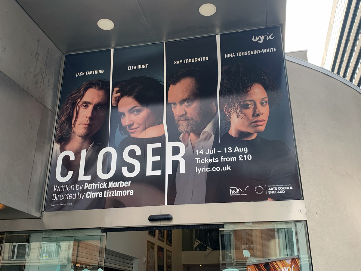
Closer – Lyric Hammersmith Box Office exterior poster
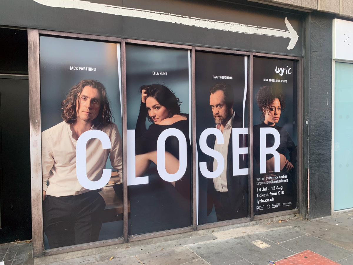
Closer – Lyric Hammersmith King St Vinyl
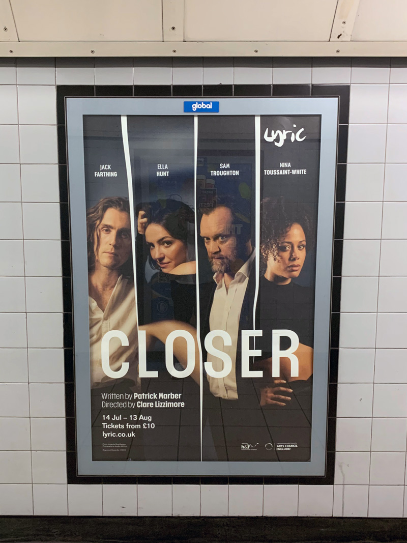
Closer – London Underground 4 sheet
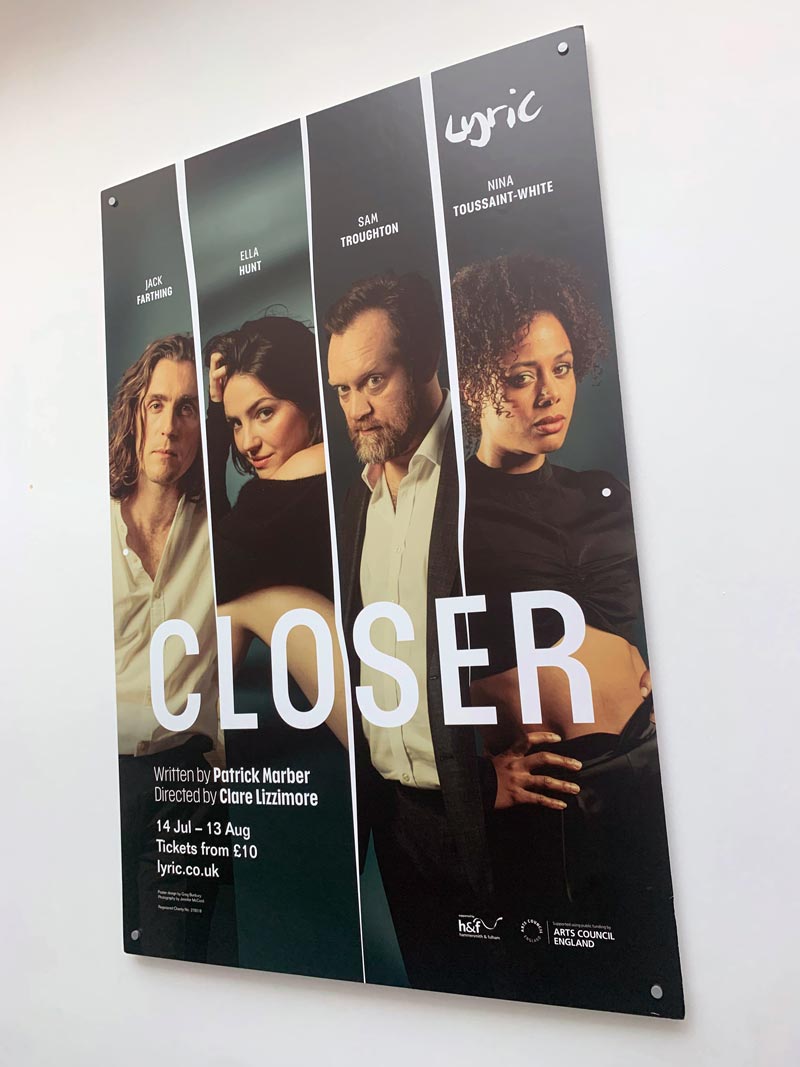
Closer – internal 6 sheet
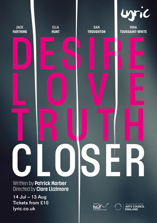
Closer – A5 flyer (alternate version)
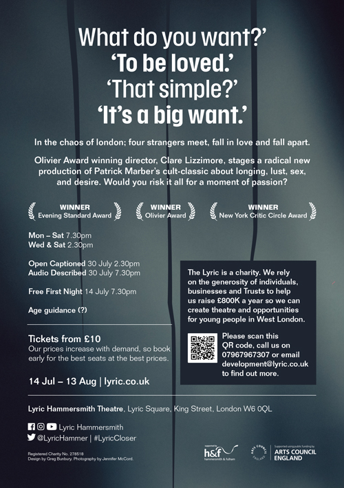
Closer – flyer reverse
