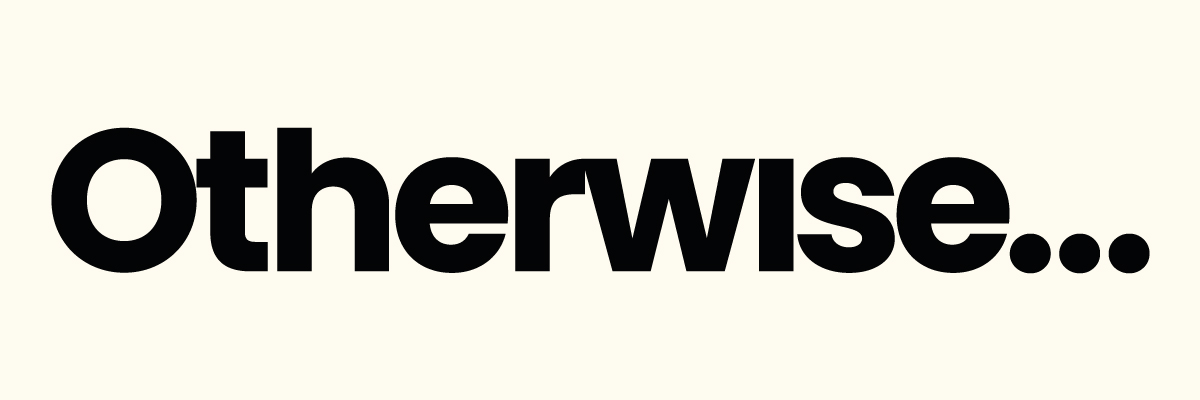
Refreshing the brand of a Black-owned business.
Otherwise is a Black-owned, family-run Atelier and design consultancy, based in South London. I was asked to consult and design a new logo identity for the store, and the brand moving forward.
I created a new wordmark that evolved from what the company had been previously using, into a cohesive identity that could be carried over from physical applications into digital spaces.
The old Otherwise signage/logo had incorporated an ellipsis into the design, however, there was no rationale or intention behind its placement. I decided to make the ellipsis a feature of the new identity, driving the construction of the refreshed wordmark, and becoming a brand icon and device.
Services:
Consultancy
Logo design
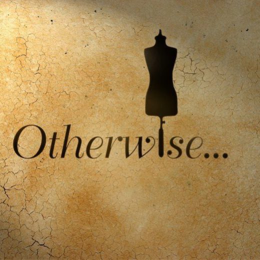
Original Otherwise logo
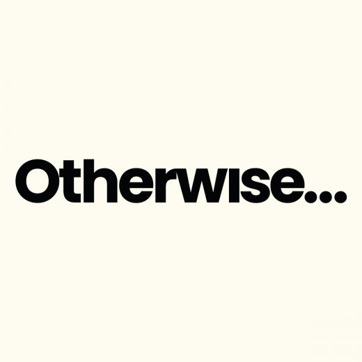
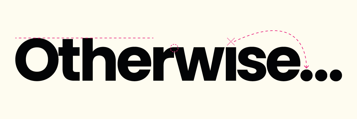
Refreshed Otherwise logo
We opted for a clean, contemporary wordmark in place of the old logo. Using the Poppins typeface, we shortened the ascender of the lowercase ‘h’, and lowered the shoulder of the lowercase ‘r’ to connect it with the ‘w’. The dot of the lowercase ‘i’ was removed, and the shape was used to create the ellipsis.
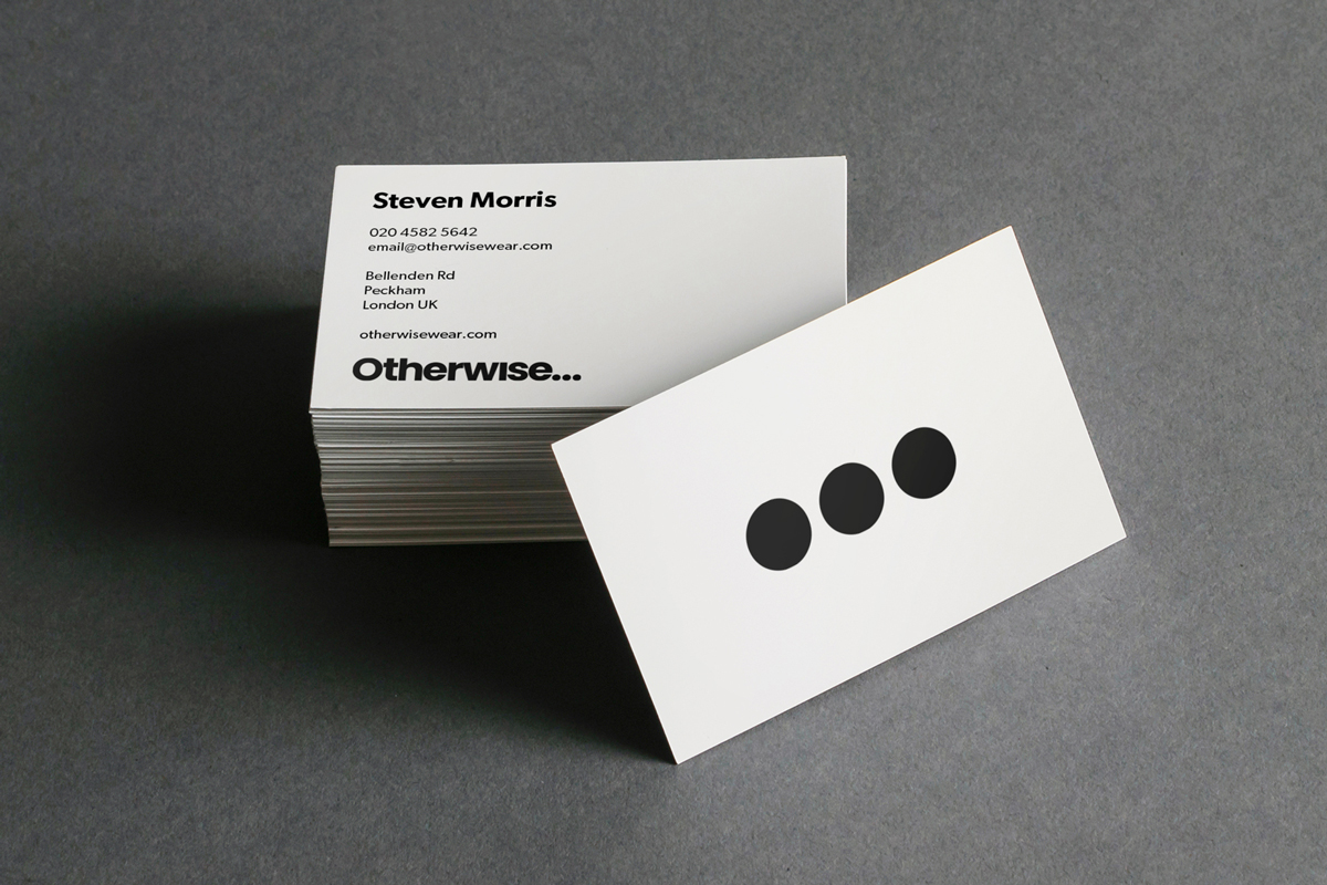
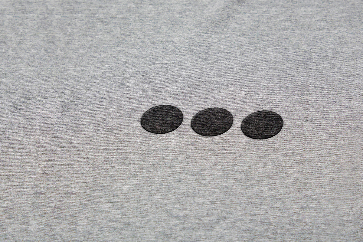
In our concept, the ellipsis is a visual representation of more to come. It doubles as the brand icon, visual device and logo across small applications, such as social media or even a monogram.
Otherwise logo by Greg Bunbury
